The term "user experience" entered mainstream vocabulary sometime around 2010, when it became a job title, a conference track, and eventually a credential. But the ideas behind it are older. Jakob Nielsen and Don Norman were writing about usability and human-centered design in the 1990s. The behavioral psychology research that underlies much of modern UX practice goes back further still, to foundational work on cognitive load, decision-making, and attention from the 1950s and 60s.
This matters because it means UX isn't trend-dependent. While specific design patterns come and go, the human behaviors that good UX design accounts for — how people process information, how they form trust, how they make decisions under uncertainty — are relatively stable. Understanding those behaviors is what distinguishes design that actually works from design that looks like it should work.
Wireframing user flows before visual design prevents structural problems that are expensive to fix later.
The Cognitive Foundation
Before getting into specific principles, it's worth understanding why UX design needs to exist at all. The short answer: human attention is limited and expensive.
Cognitive load theory, developed by educational psychologist John Sweller in the 1980s, describes the burden placed on working memory by any task that requires mental processing. Working memory — the part of cognition we use for active thinking and decision-making — has a limited capacity. When a task demands more than that capacity, performance degrades. Mistakes increase. Frustration rises. People give up.
Applying this to web design: every element on a page that requires a user to make a decision, process information, or determine what to do next consumes a portion of that finite cognitive budget. A navigation menu with fifteen items. A page without a clear visual hierarchy. A form that asks for information in an unexpected order. Each of these imposes costs. Individually, they might be manageable. Combined, they create an experience that users describe simply as "confusing" or "frustrating" — without being able to articulate why.
"The more decisions a user has to make, the longer it takes. And the longer it takes, the more likely they are to make a worse decision — or no decision at all."
— Hick's Law, formalized by William Edmund Hick, 1952Hick's Law — which states that the time to make a decision increases logarithmically with the number of choices — has been confirmed repeatedly in usability research. Its implications for web design are direct: menus should be concise, calls to action should be singular and clear, and where complexity is necessary it should be revealed progressively rather than all at once.
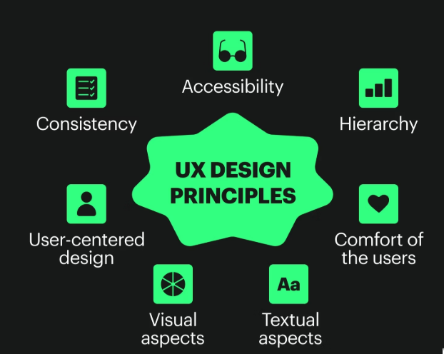
Eight Principles Grounded in Research
Visibility of System Status
Users should always know what's happening. When they click a button, they need feedback that something occurred. When a page is loading, they need a visual indicator. When a form submission succeeds or fails, they need to be told clearly. This principle — first articulated in Nielsen's 10 Usability Heuristics in 1994 — remains one of the most violated. Buttons that don't change state after clicking, forms that submit silently, pages that appear frozen during loading: all of these violate the user's basic need to know whether their actions are having effect.
Match Between System and Real World
Design language should align with how users already think about the world. Icons should represent what they iconically represent — a magnifying glass for search, a house for home. Labels should use the vocabulary of the user, not the vocabulary of the developer or the organization. When a business insists on calling their pricing page "Investment Options" because it feels more premium, they're prioritizing their preferred framing over the user's ability to find what they're looking for. Terminology research — even informal surveying of real customers — consistently reveals gaps between internal language and user language.
Error Prevention Over Error Recovery
A well-designed system makes it difficult to make mistakes in the first place, rather than relying on error messages to correct them after the fact. In form design, this means: using input type="email" so the keyboard switches to email mode on mobile, providing inline validation so users know immediately if something is wrong rather than at submission, and clearly labeling what format is expected (e.g., "Phone: (555) 555-5555"). Baymard Institute's research on checkout form design found that 22% of U.S. shoppers have abandoned a purchase specifically because the checkout process was too complex or had too many errors.
Recognition Over Recall
Users shouldn't have to remember information from one part of an interface to use another. Navigation should remain consistent. Context should be visible where it's needed. Breadcrumbs, persistent headers, and contextual labels all serve this function. Research on menu design has consistently found that users are faster and more accurate when they can recognize an option from a visible list than when they must recall the path to get there from memory. This principle is why dropdown menus that disappear during navigation — requiring users to re-open and re-find — create measurable usability problems.
Flexibility and Efficiency of Use
Good interfaces work well for both novice and experienced users. Novices need clear guidance; experienced users need shortcuts that allow them to move faster. In web contexts, this often means: keyboard navigation for power users, search functionality for users who prefer it over browsing, clear breadcrumbs for users who navigate hierarchically, and scannable headings for users who want to jump directly to relevant sections. Accessibility and efficiency often overlap here — features designed for users with disabilities frequently improve the experience for everyone.
Aesthetic and Minimalist Design
Every visual element on a page competes for attention. Content that is irrelevant or rarely needed reduces the relative visibility of everything else. This doesn't mean websites should be sparse or visually uninteresting — it means every element should earn its place. Adobe's 2018 State of Content report found that 38% of users will stop engaging with content if the layout is unattractive, while Wyzowl research found that content density is one of the top reasons users leave web pages. The goal isn't minimalism for its own sake; it's intentional design where removal is as considered as addition.
Fitts's Law: Target Size and Position
Formulated by psychologist Paul Fitts in 1954, this law describes the relationship between the size and distance of a target and the time required to reach it. Applied to UX: important interactive elements (buttons, links, call-to-action areas) should be large enough to click or tap easily, and positioned in locations where users naturally look and reach. On mobile, this means minimum tap target sizes of 44×44 pixels (per Apple's Human Interface Guidelines) and primary actions positioned within thumb reach. Research from MIT Touch Lab found the average human fingertip is 1.6–2cm wide — far larger than many mobile tap targets in the wild.
The Role of Trust Signals
Trust isn't a UX principle in the traditional sense — it's an outcome. But it's an outcome heavily influenced by design decisions. Physical trust signals include: professional photography (not stock photos that look generic), testimonials with real names and identifiable details, visible contact information, SSL certificates, privacy policy links, and case studies or evidence of work. Stanford's Web Credibility Project identified 10 guidelines for web credibility, finding that design quality was among the most influential factors — more so than some informational content elements — because users make credibility judgments based on visual design before reading content.
The Gap Between Theory and Practice
These principles are well-documented and not especially controversial among practitioners. Yet violations of them are ubiquitous. The gap between what research says works and what gets built is real, and it exists for several reasons.
First, UX problems are often invisible to the people closest to the product. When you know how something works, you can't unsee that knowledge — a phenomenon psychologists call the "curse of knowledge." The navigation structure that seems obvious to the designer who built it may be genuinely puzzling to a first-time visitor who doesn't share the same mental model.
Second, many UX decisions get made by committees where different stakeholders have different priorities — and those priorities often don't align with the user's interests. The marketing team wants more information on the homepage. The sales team wants more calls to action. Legal wants a disclaimer. The result is a page that's trying to do too many things at once, serving no one particularly well.
Third, testing is expensive and takes time. The most reliable way to identify UX problems is to observe real users attempting to complete real tasks — a process that reveals problems no amount of internal review can catch. But formal usability testing requires planning, recruiting participants, analyzing results, and implementing changes. It gets deprioritized.
What Practical UX Looks Like Without a Research Budget
Most small business websites aren't built with dedicated UX research. That doesn't mean the underlying principles don't apply — it means the methods for applying them need to be scaled down.
| UX Challenge | Low-Cost Approach | What to Look For |
|---|---|---|
| Navigation usability | Ask 3–5 people unfamiliar with your site to find specific information | Where they hesitate, where they click first, what they expect to find where |
| Form completion rates | Review analytics for form abandonment; shorten fields | Drop-off points within multi-step forms |
| Mobile experience | Test on real devices (not just browser resize) | Tap target accessibility, text readability without zooming, form input behavior |
| Content clarity | 5-second test: show homepage, hide it, ask what the site does | Whether users can correctly identify your business and primary offering |
| Page performance | Google PageSpeed Insights (free) | Core Web Vitals scores, specific recommendations for improvement |
| Exit behavior | Google Analytics exit pages report | Pages where users disproportionately leave; investigate why |
A Note on What UX Design Can and Cannot Do
Good UX design removes friction. It makes it easier for people who are already interested in what you offer to engage, understand, and take action. What it can't do is create interest where none exists, substitute for a weak value proposition, or compensate for products or services that don't meet user needs.
This is a distinction worth making clearly, because it's common for UX improvements to be credited with outcomes that are actually driven by other factors — or blamed for a lack of improvement when the underlying business problem is something design alone can't solve.
"UX design is about making existing motivations easier to act on — not generating motivations that aren't there."
— A useful framing for setting realistic expectations with clientsWhat this means for businesses evaluating whether to invest in UX: the question isn't whether good UX produces results — the research on this is reasonably clear. The question is whether the current user experience is actually the bottleneck. Sometimes it is. Sometimes the bottleneck is the product itself, or the marketing, or the offer. Identifying which problem you're actually solving before investing in design is worth doing.
The Long View
UX design, done well, is invisible. The goal is an experience so smooth that users accomplish what they came to do without ever thinking about the interface. When a site is working properly, you don't get compliments about it — you just get conversions, return visits, and the absence of complaints.
That invisibility can make UX feel like a strange investment. You're paying to remove obstacles users may not be consciously aware of, in service of an experience they'll likely take for granted. But the cost of those invisible obstacles — users who never completed the form, visitors who couldn't find the information they needed, potential customers who made a judgment about your credibility based on a dated design — those costs are real, even when they're hard to measure directly.
The principles here are a starting point, not a checklist. Good UX practice involves iteration, observation, and a consistent willingness to prioritize the user's experience over internal preferences. That orientation — toward the person actually using the site, not the person who built it — is what distinguishes effective UX from design that just looks like it should work.
Want a UX review of your current site?
We do honest assessments — focused on actual usability issues, not upselling. If there's nothing worth changing, we'll tell you that too.
Request a Review